MY TELUS APP - OVERVIEW
With over 2 million users, the overview screen is the most critical touchpoint in the My TELUS app.
Users spend an average of four minutes per session, primarily scanning for essential information such as usage and billing status. The challenge was to redesign the overview experience to surface this information clearly and efficiently. The new approach focuses on a clean, minimal layout that better supports quick comprehension and maximizes the limited time users spend in the app.
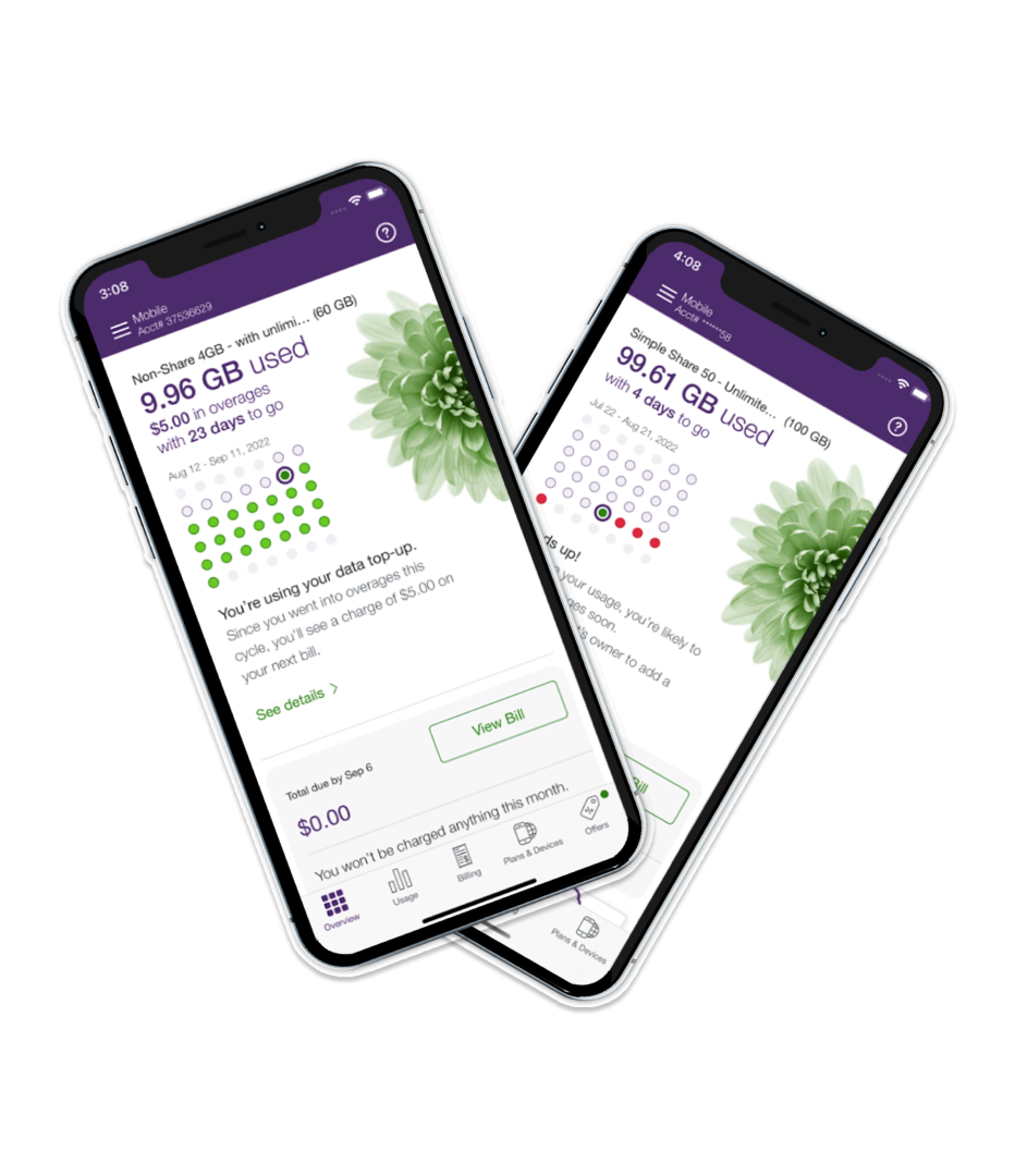
The previous overview screen presented too much information at once, resulting in a cluttered and difficult-to-scan experience.
A calendar and color coding were used to communicate usage status, but this approach required extra interpretation and slowed down comprehension. Key messages were lengthy and lacked visual hierarchy, making it difficult for users to quickly understand their account status at a glance.
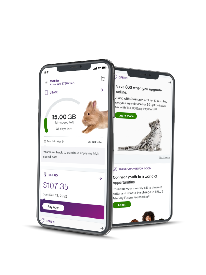
We redesigned the TELUS mobile experience using a clean, branded approach to improve clarity and usability.
Key Improvements:
Simplified Usage Tracking: Users can now easily see their data usage status with clear, readable callouts.
Action-Oriented Design: Different component states were introduced to create urgency, guiding users to take action when needed.
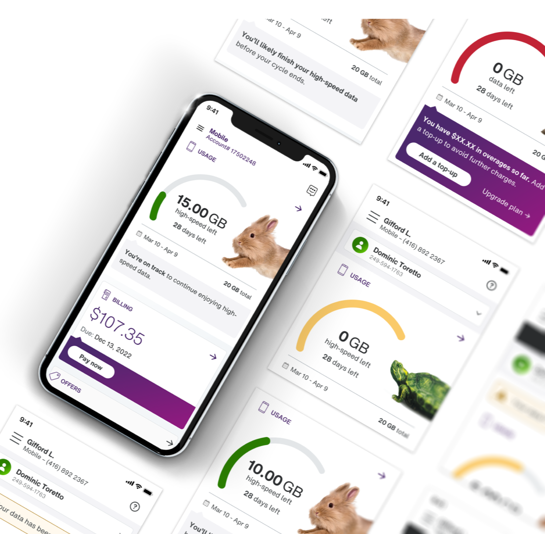
Scalable & Accessible: The design works seamlessly across all account types—from single subscriptions to multi-subscriber accounts—and meets all accessibility standards.
Outcome:
A cohesive, user-friendly interface that makes managing mobile usage and billing straightforward and visually engaging.